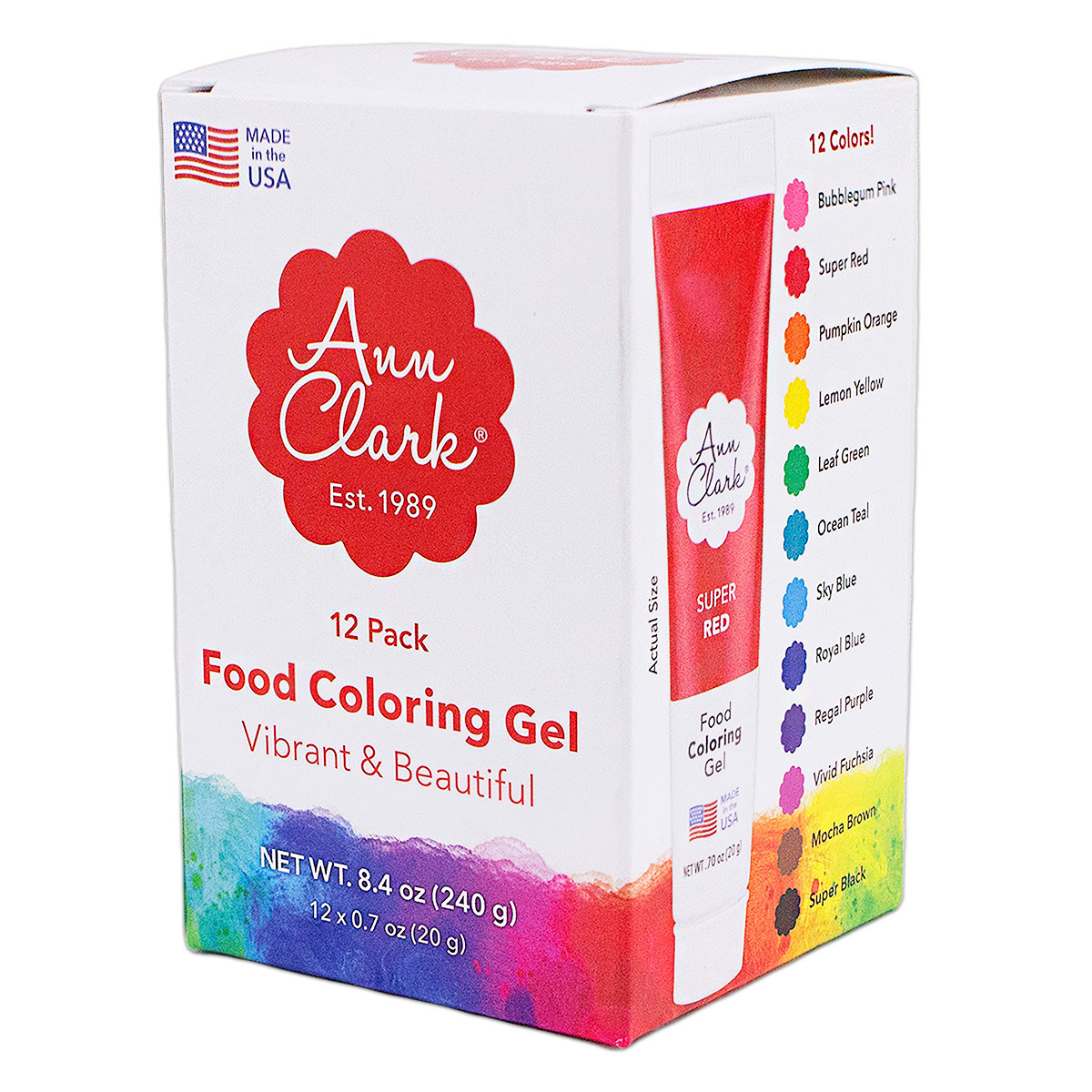
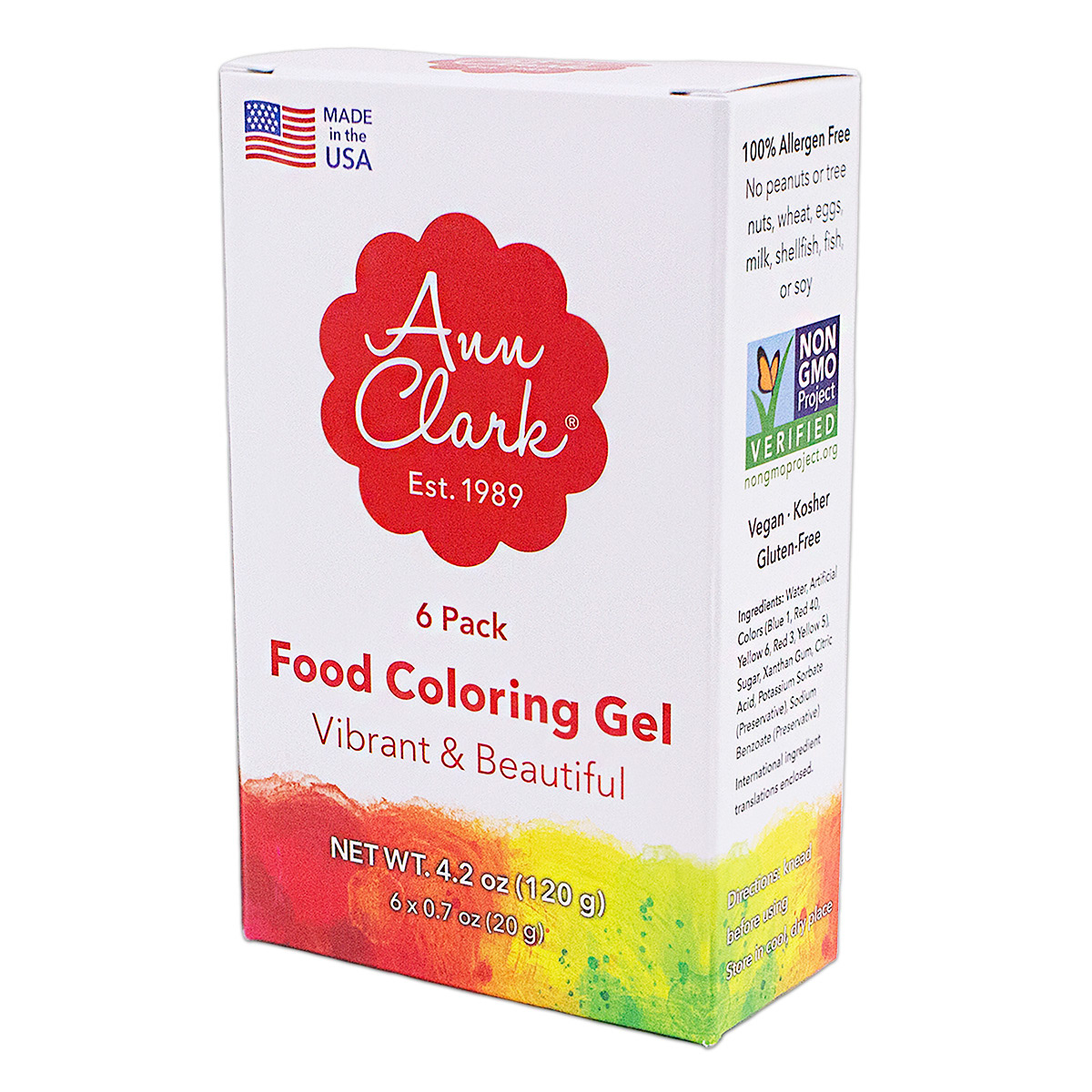
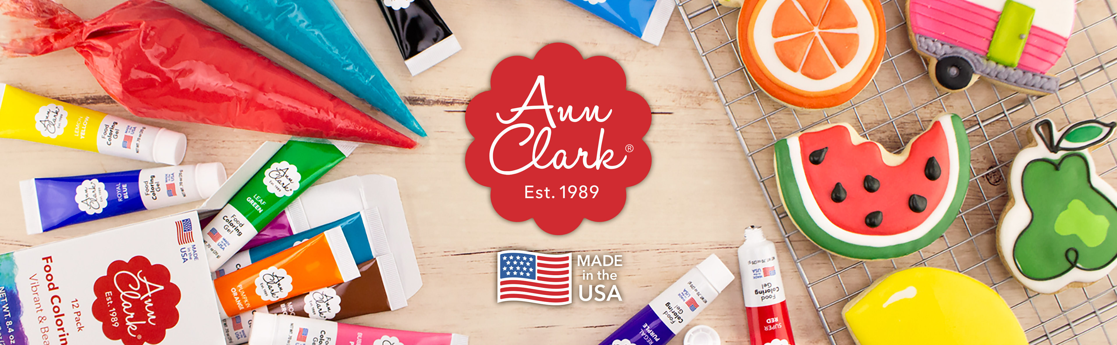
Package Design

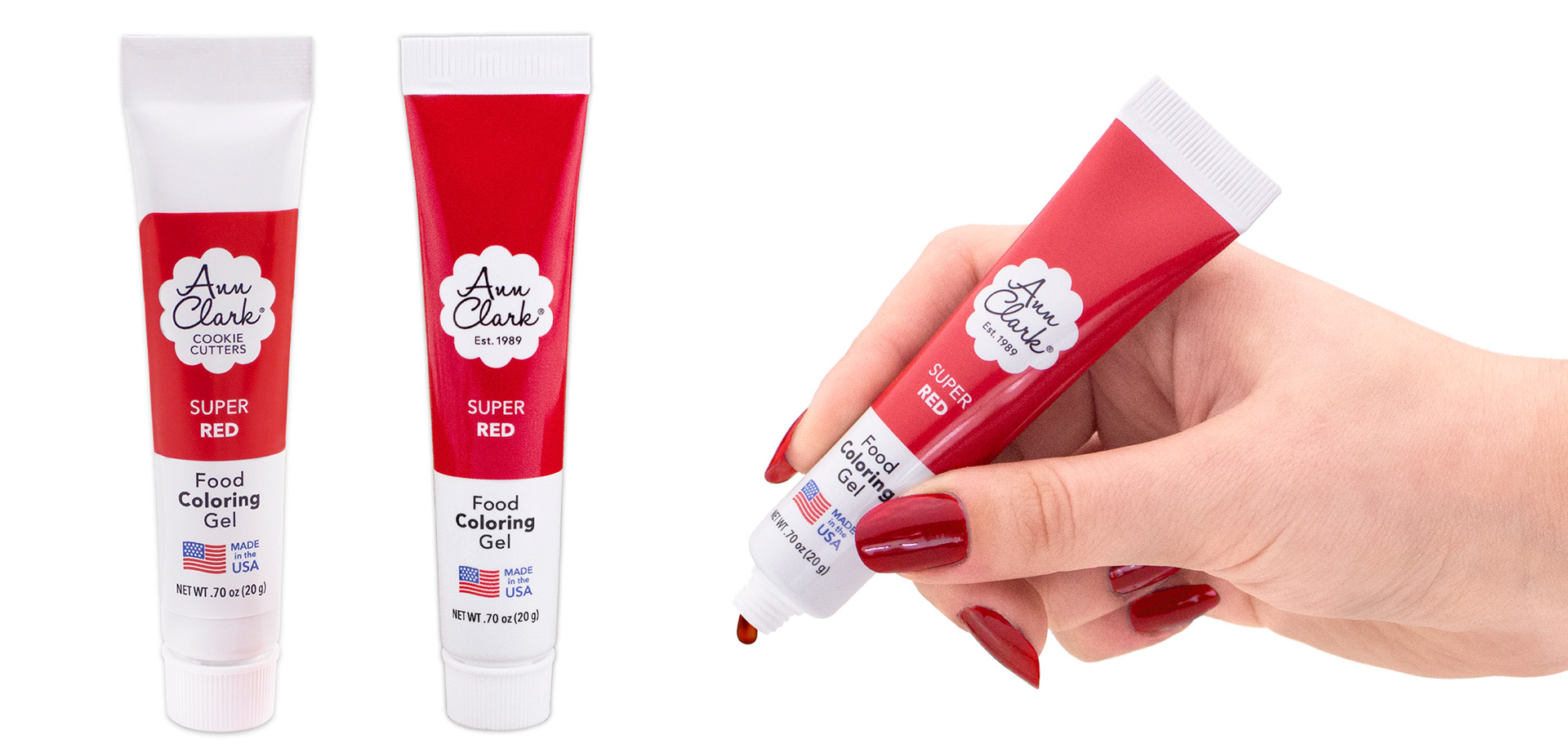
Packaging for food coloring gel- Left is the previous design, to the right is the redesign, with 1st and 2nd iterations between a sticker label and a fully printed tube. I really wanted to reconnect the design for these with the roots of the company and founder herself, Ann Clark; my work was heavily inspired by paint tubes, like the watercolors Ann still uses in the office.


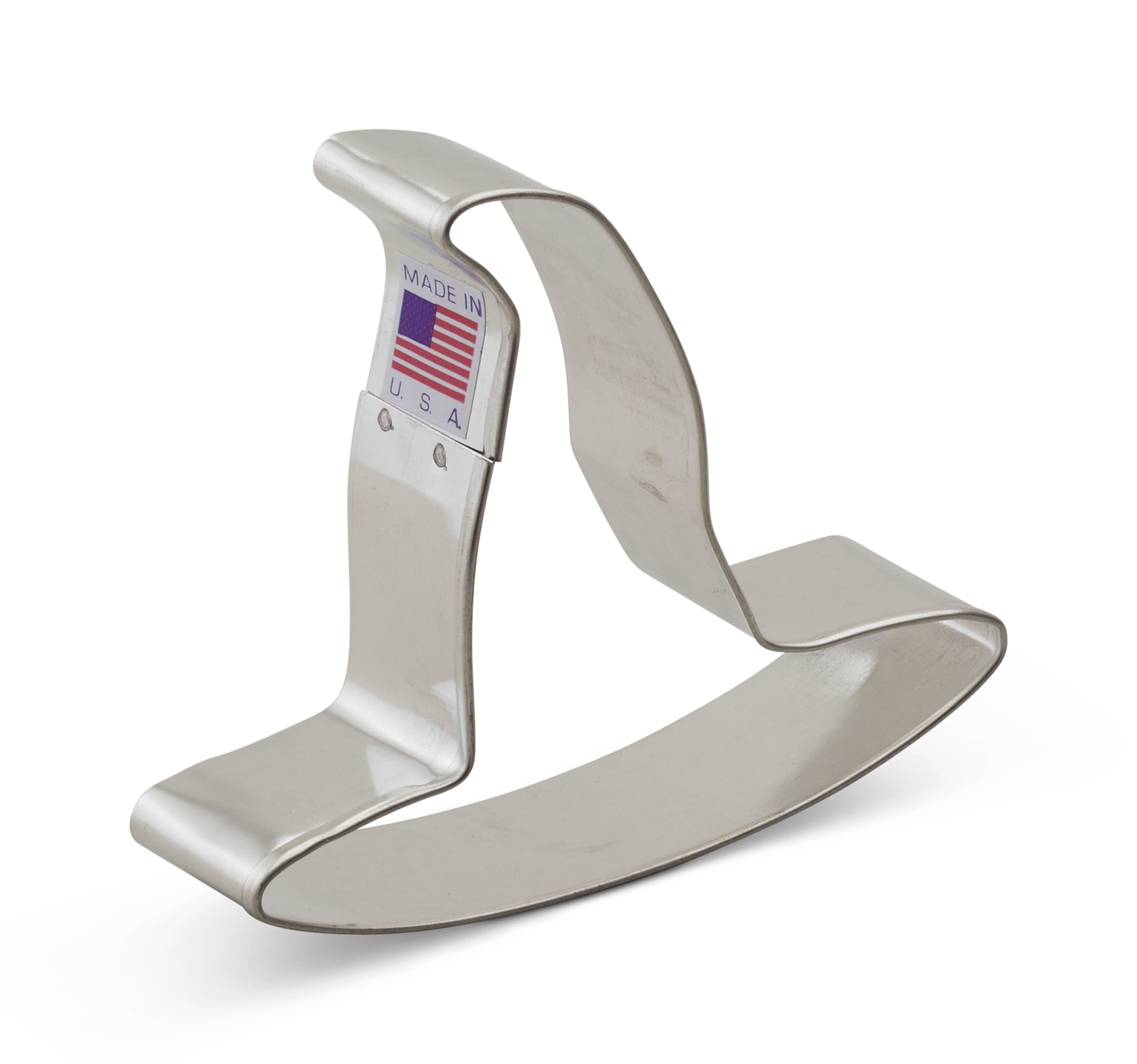
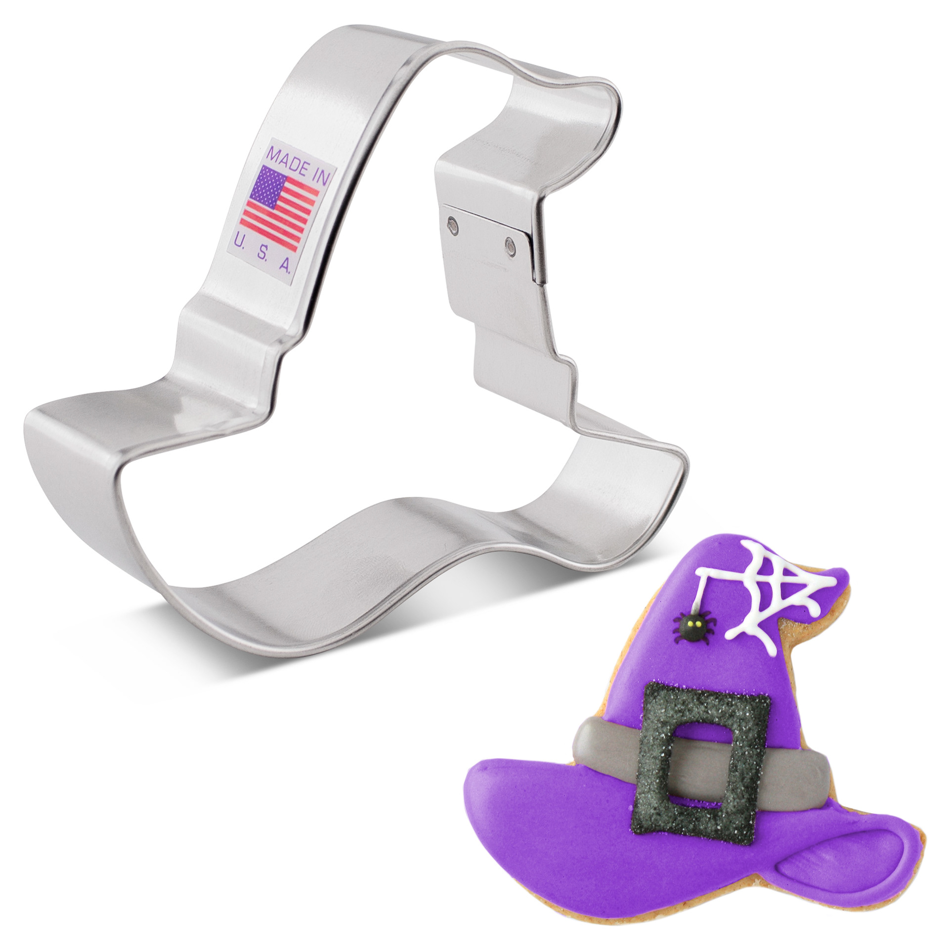
Cutter Shape Rework- Before & After
Some of preexisting shapes, like the witch hat shown below, were quite skinny, and the cookies they produced were prone to burning. These shapes were also harder for production workers to remove from the die casting. I redesigned the shape in a way that would make it softer and rounder(while still being recognizable), which would make both a better cookie, and an easier shape for production workers to make.
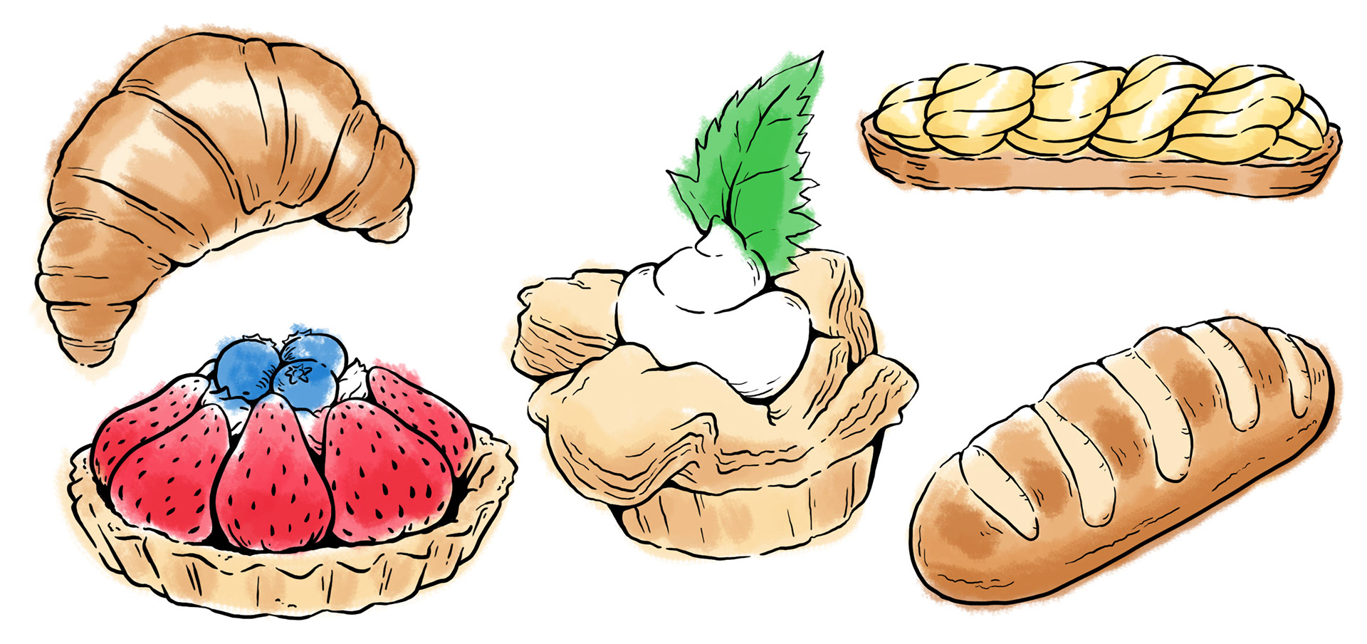
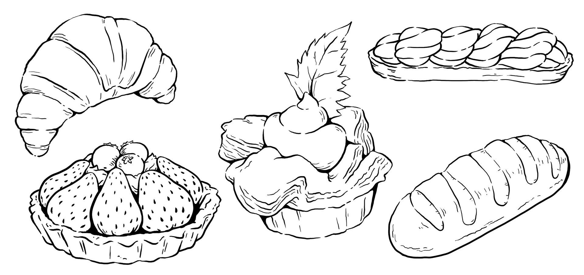
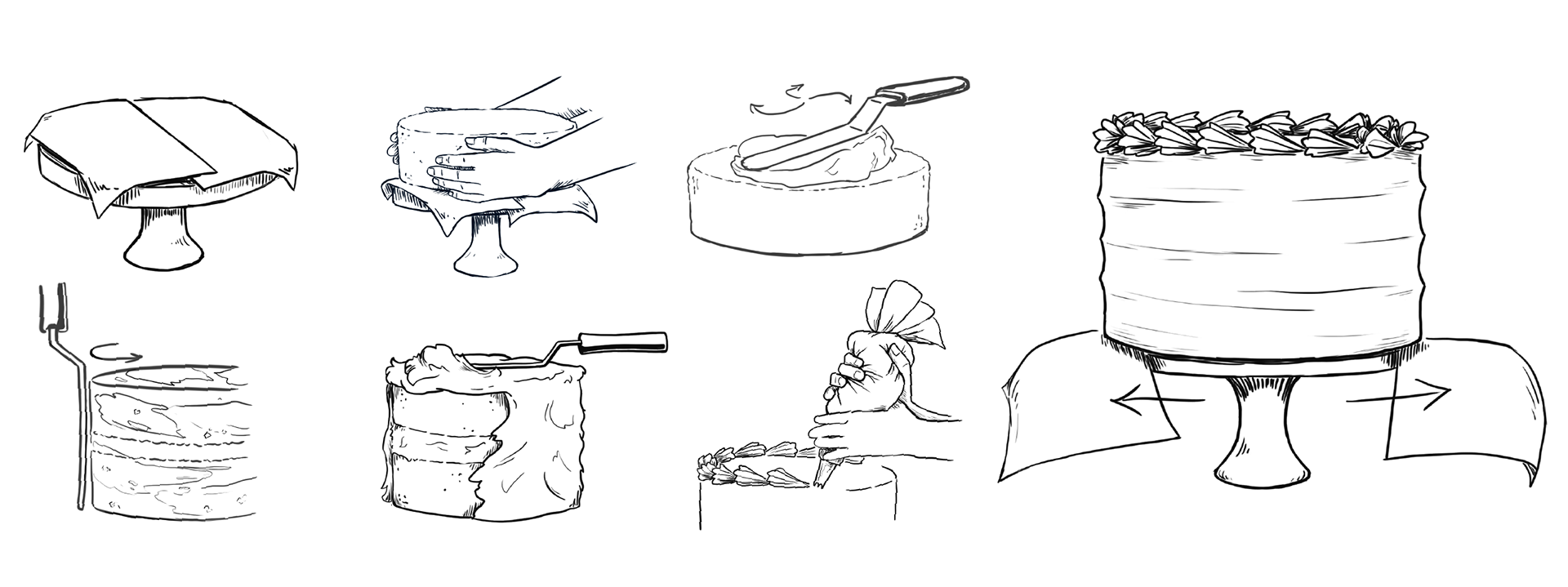
Icons & Illustration
Video Ads
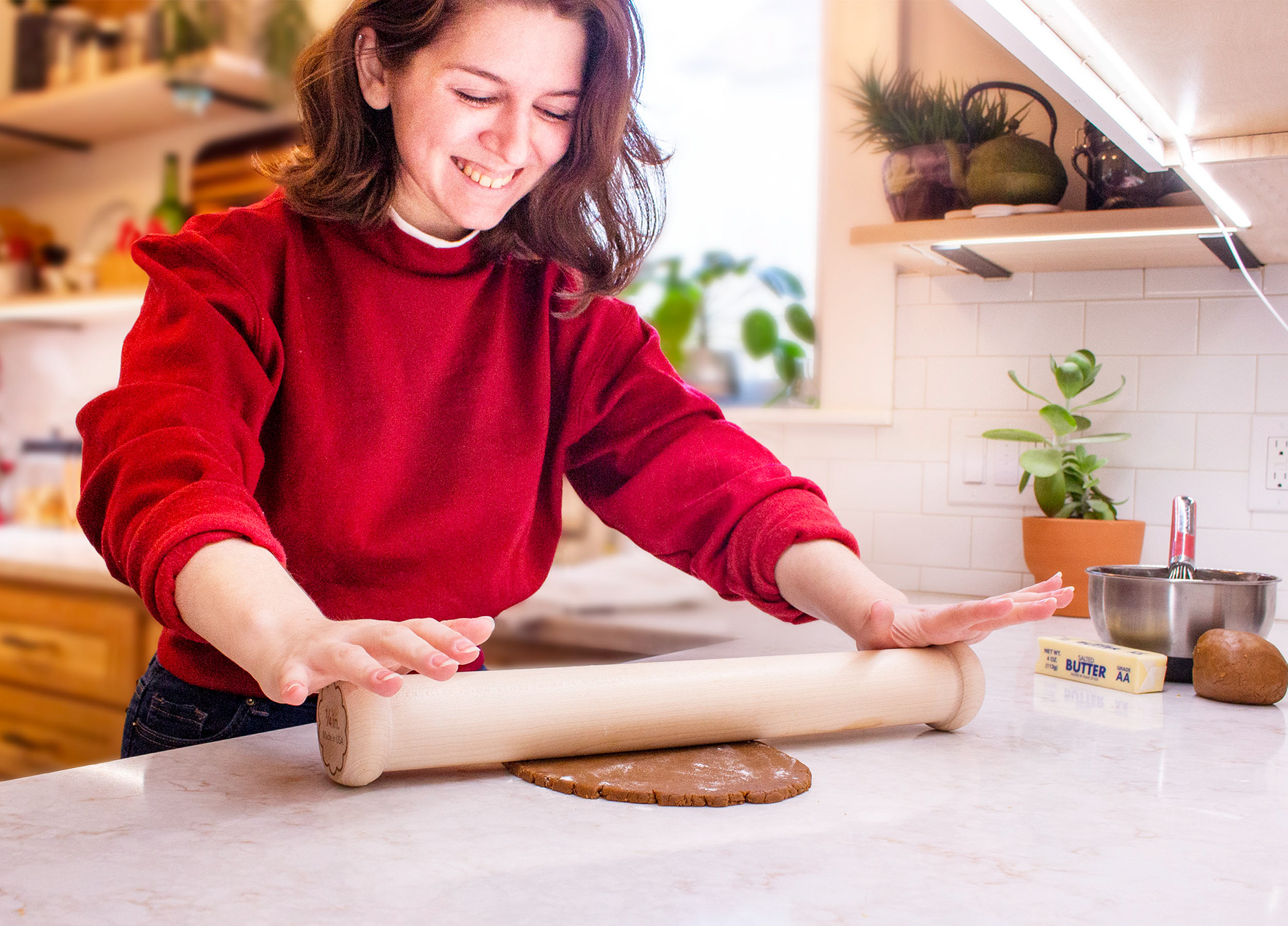
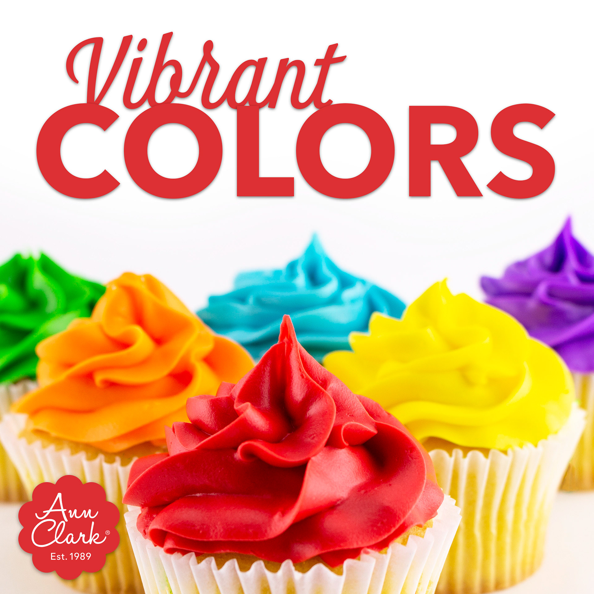
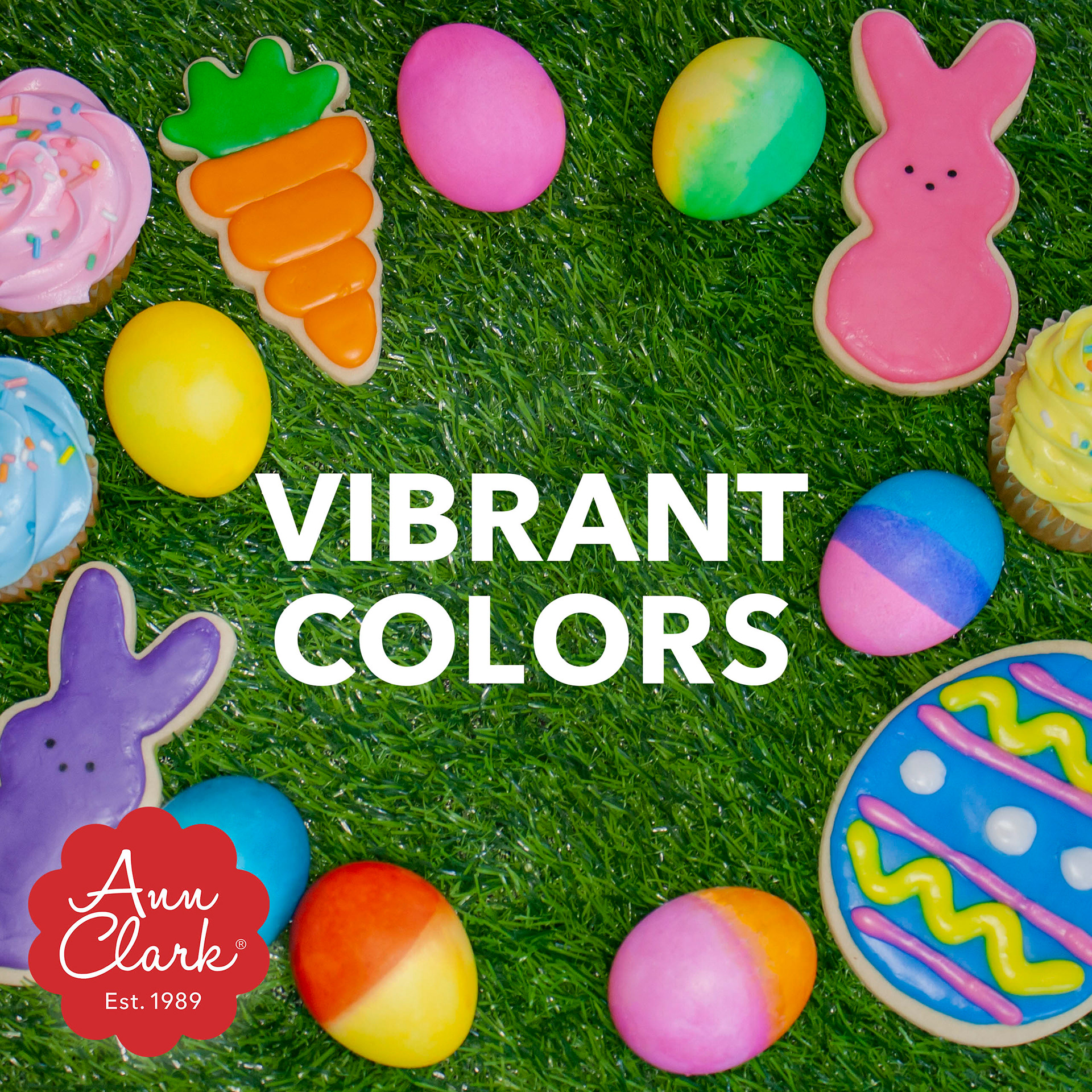
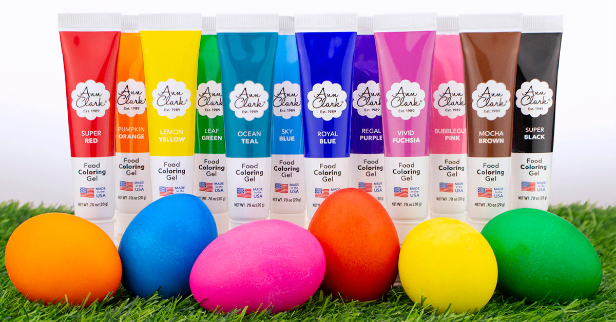
Digital Marketing Content- ft. Photography

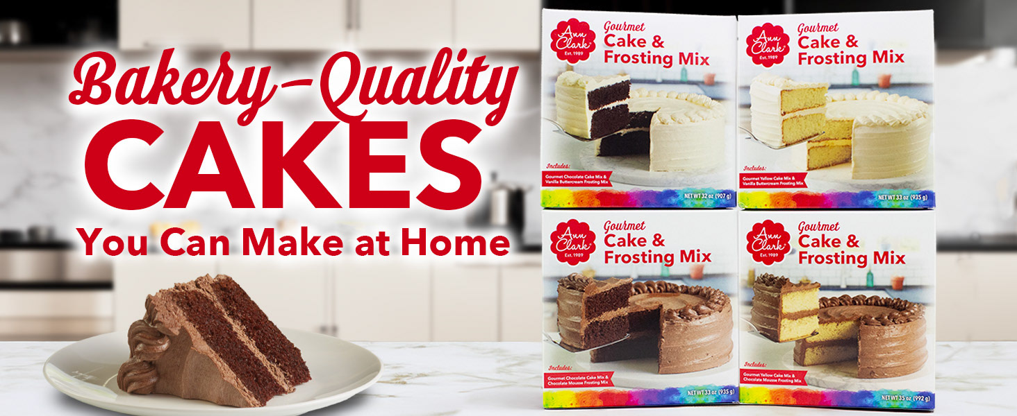
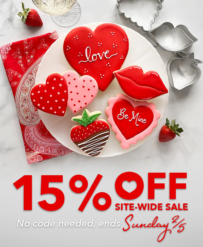
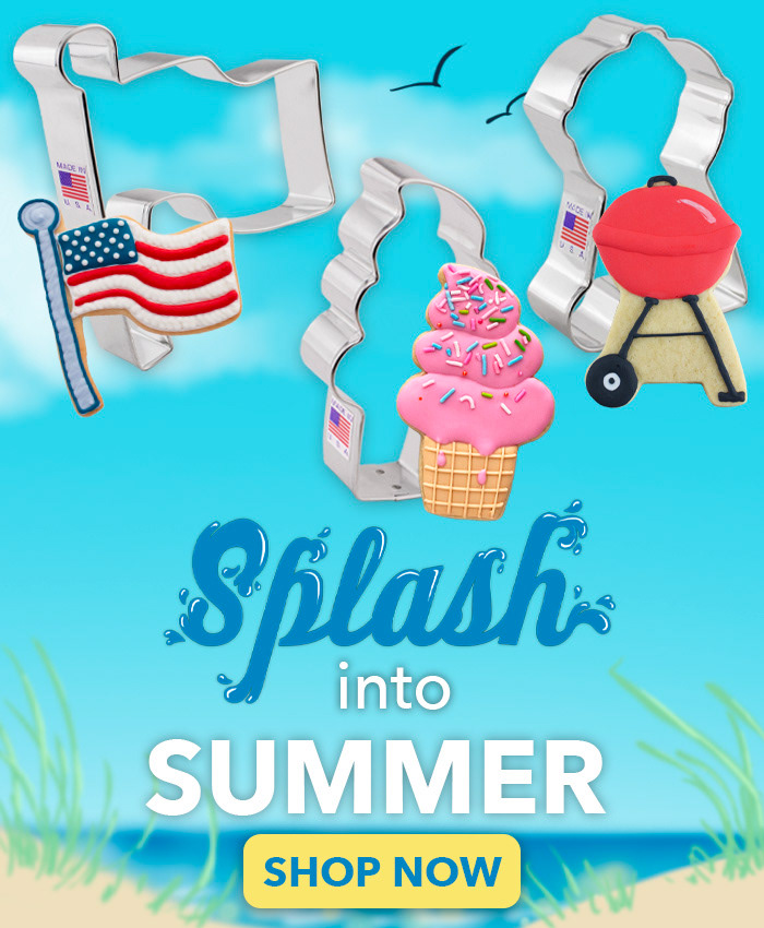
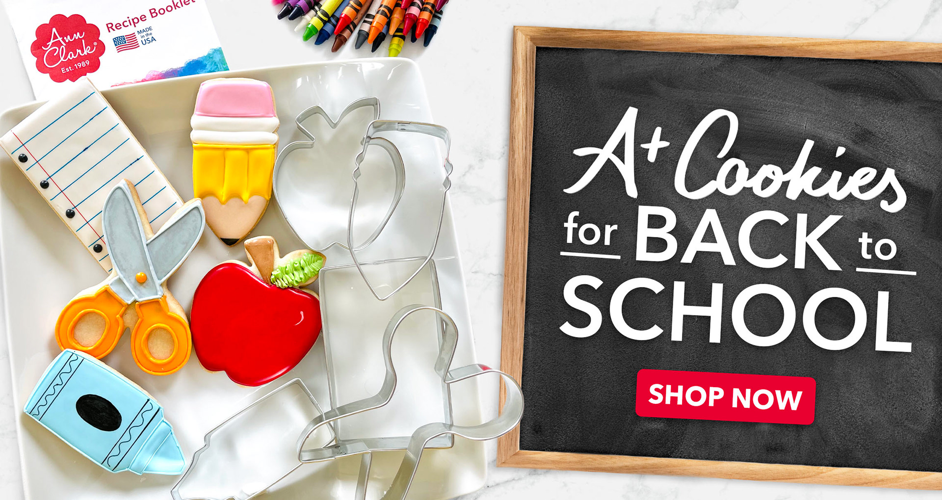
Website Banners for desktop & Mobile
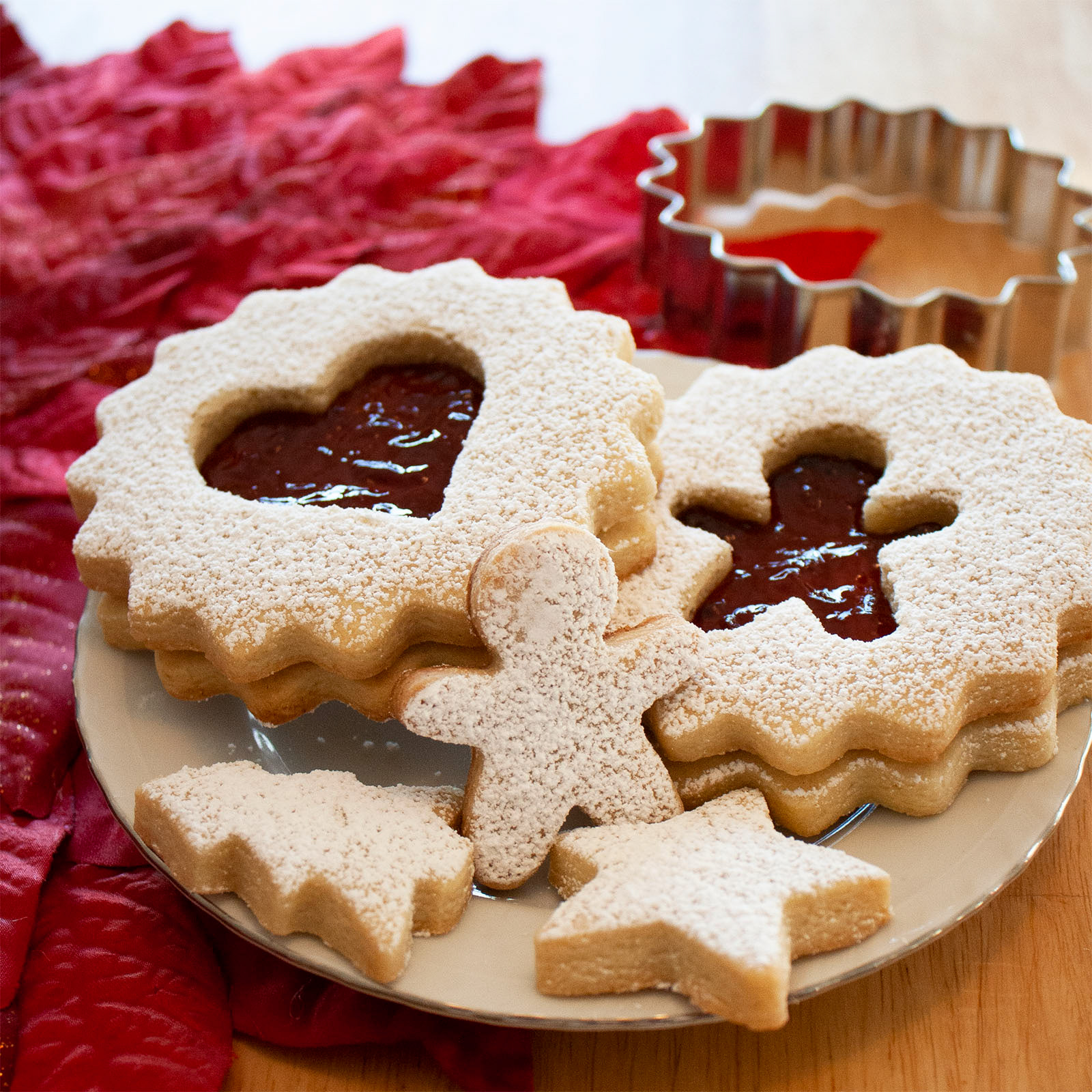
Below valentines cookies and photo by Cookier Mary Mansfield
Back to School cookies by Cookier Julia Perugini

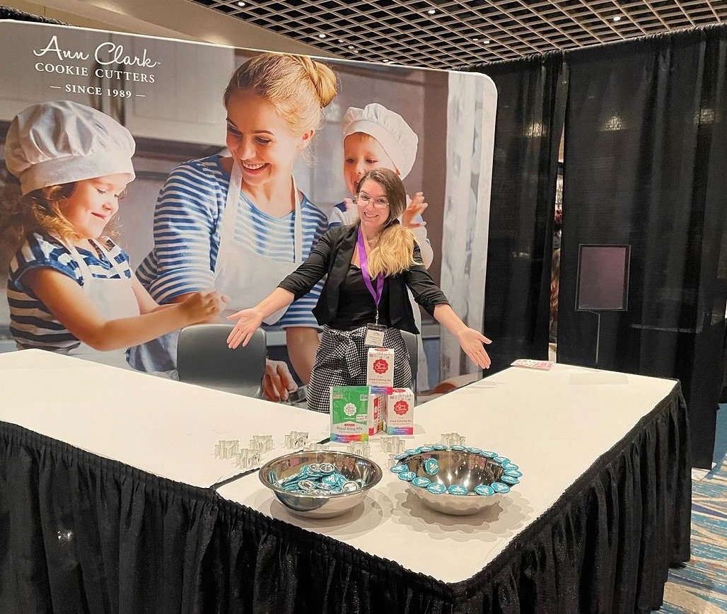
Having a blast at CookieCon! We managed to give away just about everything at the table!